This is Part 2 of 4 posts on Windows 8 Consumer Preview and Server 8 beta. There might be a Part 5 focused on Server 8 only. However, that is a game-time decision.
- Part 3: My conclusions on Windows 8 Consumer Preview
- Part 4: A review of the apps I have purchased with the Windows 8 Store

As Windows 8 moves from the pre-beta for the beta, dubbed a “Consumer Preview” by the powers-that-be at Microsoft, the time has come to turn a critical eye on the product, in hopes that issues identified now would be corrected by the time the product goes gold.
These are my thoughts on Windows 8 Consumer Preview so far.
Download & Installation
Download: Almost simultaneous with the announcement of the Consumer Preview, Microsoft made the preview bits available for download.
That’s where the first issue occurred: the download link was for an upgrade, not a clean install! And only after the the process started would you be made aware of this. If there was any notification of this, it wasn’t visibly apparent.
Nicely, Microsoft seemed to have adequately provisioned CDNs for fast downloads. I had no problems with the download from either the O’Odua or MedikLabs; with the delivery fast enough, even taking into consideration the fact that broadband here in rural NE Colorado, well, sucks.
SoCal and NoCal experienced no hiccups, with everything going smoothly.
Installation: Buried deep within the install FAQ is a note informing prospective testers of the requirement of a product key, with one duly provided. That information is buried deep, and not easily accessible. Not good.
However, installation of Windows 8 CP, as since the late unlamented Windows Vista, was a breeze: it takes about 17 minutes. Period.
We have installed W8CP on approximately 53 systems without any issues. Better than that, we didn't, and so far, haven’t had, any major issues with driver compatibility*.
Windows Server 8 Beta: Conversely, the download and installation of Windows Server 8 beta was smooth and trouble-free. I initially installed it on a Proliant ML110, and selected the GUI option. I later installed the Windows Experience Pack, since you know, I like Windows :-) Easy, peasy.
My only issue is that there are no enhanced video drivers for the console. Makes using it undeniably ugly.
Apart from that, installing the management apps we use at Logikworx went smoothly. I have retained the services of our trusty Windows 2008 Small Business Server at the Orbiting O’Odua as well as a Windows Home Server for backups. At MedikLabs, I simply made the VM containing their EMR/EHR installation over, and made it ready. I also installed my management software on the WS8b box there. Both of the installs were on Proliant ML350s.
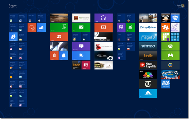
The Metro interface

The tiles, especially the live tiles, are immediately useful, and informative, and intuitive, and the iconography is peerless.
Mind you, I don’t know if that is because I have been a satisfied user of Windows Phone 7. However, I do know that the easy presentment of apps and Metro functions makes using Metro a snap. The Metro ‘Charms’ – command and control functions – are never more than a finger flick (touch-enabled systems) or a mouseover-to-the-monitor’s edge (non-touch) away.
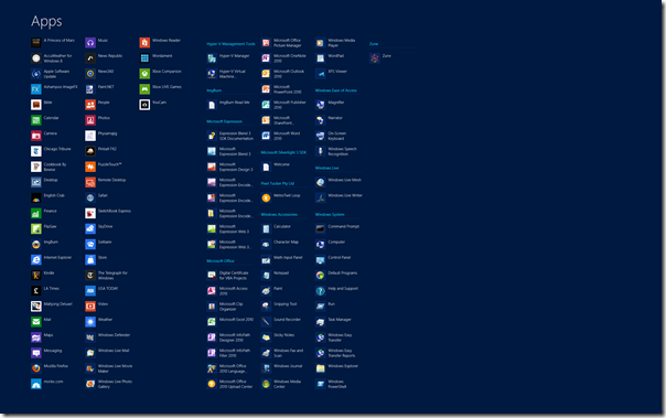
Included with Metro, are a set of 17 Metro apps that, in my opinion, show the promise of how powerful Metro, which is powered by the mighty Windows franchise, could be.
Using the default Metro apps
So, I’ve used the Metro apps. What did I find, or like?
Calendar
The Calendar app is fast, sharp and crisp for viewing, and easy on the eyes.
It automatically pulled in my appointments from the Windows Live ID I used for the install, easily displaying them.
However, in this release, the app does not have a Todo list, and while you can add appointments, you cannot delete them. I repeat, you cannot delete any appointments!
You also cannot multi-select items.
Camera
The camera app is a conundrum.
At initial startup of the camera app on the system, , it asks for permission to use the system’s camera and microphone. If denied, it goes into dumb mode, displaying nothing until the user figures how and just what is going on. A more useful and informative dialog box would help relieve this, and solve many a phone call to tech support.
But it works. It works well, and like a smartphone’s camera, it also allows you to use a webcam as a video source from within the app. However, it saves those videos to the Pictures folder.
The most annoying thing about Camera though, is the lack of instructions anywhere. You’ve got to ask Microsoft how the heck do they think average Joe & Jane would determine what the controls are?
Finance
The Finance app is of no value to me. As a result, it is the only app I have uninstalled all systems.
Internet Explorer
Metro IE, with all the promise it holds, does absolutely nothing for me!
Why?
Cannot be customized, no home page, no bookmarks, no easy, intuitive way of tab determination; no this, no that.
It is almost as if this product was created for people devoid of brain activity!
So I refuse to use it.
Meanwhile, this position is in total contrast to my position of desktop IE, which is the ONLY browser Logikworx supports, and is the only browser in almost 90 percent of all our client’s infrastructure.
Go figure, right?
Mail is one app that is immediately useful.
The integration of Mail with Windows Live login is excellent, and I love the live tiles, updating and notifying users on the Start menu.
The ability to add Microsoft Exchange is genius, with adding multiple Hotmail accounts a plus.
What I don’t like at all is the fact that Hotmail accounts are headlined “Hotmail”, with the account details subtitled below it. Ideally, one doesn’t need to be reminded that it is a Hotmail account, right? Hopefully, that gets sorted right away.
What is perplexing is the fact that as of today, you can add Gmail accounts, but not POP/IMAP accounts! Seriously, who is the clown who thought this was okay?
Verdict: very useful, but the lack of POP/IMAP account import reduces the value;
Maps
Maps rocks!
This app is very good, well thought out, and presents information clearly.
I was pleased to see that my rural local, and indeed, the Orbiting O’Odua finally caught in its splendor on Maps.
Directions were clearly laid out, and easy to read and follow.
Messaging
Confession: I almost NEVER use Messenger.
I have probably not used it on any system since before Windows 7 went live, and my primary reason for not doing so is the fact that I can use the messaging functions in Lync to achieve the same results. My siblings prefer to disturb call me on the phone rather than message me online.
From my 2-minute test of the product, I realized that I would like Messaging to explicitly ask me for permission before setting my messenger status to online. That is a major fail right there.
Verdict: ho-hum, for not explicitly asking permission to reset online status;
Music
The Music app is slick in a Zune-esque way, displaying graphics and animations with great aplomb.
That’s where the love stops!
It is uncharacteristically sloooow! In operation is it a very poor cousin to the afore-mentioned Zune.
Oh, and guess what?
It DOES NOT search you computer for media at first start!
It just…sits there!
Doing…NOTHING!
So after a while, I scream, “Are you freakin’ kiddin’ me???”
Mind you, there ISN’T even an option to manually search your system for audio media.
So after I pipe down, I leave Metro, goto desktop, fire up Windows Explorer, copy files from a secondary drive/partition, and then go back to Metro, fire up Music.
Then wait for umpteen minutes as it catalogs –the already cataloged – music files.
This is a consumer app?
This needs fresh thought; it needs a total reimagineering of the user experience
Verdict: definitely a work in progress. ;
People
I like the People app.
The UI is fresh, contacts are logically and intuitively laid out
People also displays activity from your contacts and yourself, rotating them in a pleasing slideshow.
However, all you can do is view the activity. In an ideal world, I would able to make the activity actionable, and be able to either reply or forward the news.
As with the Contacts app on Windows 7, this app presents all your Windows Live contacts. Since I have Twitter linked to my Windows Live ID, those got presented as well. The ability is also provided to add LinkedIn, Google (cue Nancy Kerrigan, “why, why WHY???”), and Microsoft Exchange contacts.
Apart from Google, I like that.
Better yet, I like the idea and practice of a unified contact list. It helps, and makes contacting them easier. This sort of Social Media integration is nice. Moreover, the integration of these contacts is automagic, and unlike the Music and Video apps, performed automatically.
I have a problem with that: ideally, the app should ask me for explicit permission before doing so.
What disturbs me though, is that there isn’t any way to differentiate the contacts according to what original list they come from. This is not good. It makes inadvertent cross contamination of contacts easily possible.
I for one would really hate to contact someone with a similar name as another, and make a fool of myself.
Verdict: That alone, is what stops this app from attaining the 5-star pantheon.
Photos
The photo app is nice, slick, intuitive.
However, like Music and Video, it does not autosearch or allow searching/adding directories other than the default video media location.
It does allow for integration of Facebook and Flickr photos.
Remote Desktop
This is about my favorite Metro app so far.
It provides a pleasing and fast RD connection to other systems on the network.
It does the job, and does the job well.
I like it. A lot!
SkyDrive
SkyDrive shows what Microsoft can promise, and what it delivers when it cannot let go of the vestiges of it’s silliness of old.
- SkyDrive integrates into Windows upon install. Good
- SkyDrive preserves web-based folder hierarchy. Good
- SkyDrive does not let users choose default SkyDrive store location. BAD
- SkyDrive syncs files back and forth. Good
- SkyDrive does not easily let users add new files. BAD
- SkyDrive does not automagically subsume, integrate with, or import Live Mesh folders. BAD
- SkyDrive does not let users perform the FolderShare PC-to-PC file and folder synchronization any longer. BAD
You have to ask yourself, what were the yum-yums on the SkyDrive team thinking?
- Remember Remote Connections? Well, forget that functionality. It has gone bye-bye! VERY BAD
Verdict: Still a work-in-progress;
Video
For my thoughts on the Video app, read my notes on the Music app.
Why this deserves more ink is because while being as brain dead as the Music app, Video adds another level of stupid by polluting your video wall with seemingly random videos culled in from the Internet.
All this without asking you, in very bold letters and not the long verbiage obviously derived by the numbskulls in Microsoft Legal
I freaked!
In fact, I am still freaked out by it
Weather
The weather app is beautiful, well written, useful.
I like and use it, with my only issue the fact that the little hamlet in Nigeria where my Dad was born cannot be pulled up. Also the village where my Mom’s folk hail from. Annoying J
Verdict: a true first class app;
Windows Reader
Now, you’re talking. The ability to use a built-in PDF reader is quite cool. While it is not as featured as the Logikworx current recommended application, NitroPDF, but it works.
My only issues with this product is 1) it doesn’t retain customizations – I have to set it to one-page-at-a-time, every time it starts up, and 2) there isn’t a desktop version of this app. At this time.
Xbox Companion
Connected it to Xbox. Played around with the controls. Jury’s still out on the value of this app. Leastways for me.
Verdict: neutral; no rating
Xbox Live Pinball FX2
This is my #2 son’s current favorite Windows 8 Consumer Preview feature.
However, this product is going to cost me, as it runs friggin’ slowly on his TouchSmart IQ518, the first product ever to do so. Funny enough, this slowness is new, didn’t occur with any of the apps from the Developer Preview.
That said, the product is fast and cool on all other systems. I like it
Xbox Live Solitaire
Windows and Solitaire go hand-in-glove.
I haven’t played Solitaire since the release of Spider Solitaire. However, since W8CP doesn’t have Spider, I have been playing Solitaire, and I like it. The graphics and animations are pretty, effective.
Using the Store
Windows 8 Consumer Preview features the debut of the Windows Store.
Windows Store is at once familiar and useful. For it is quite reminiscent of the Windows Phone and to a lesser extent, the Zune marketplaces.
Store displays an issue I have with most of the Metro apps: where is the damned Search button or box?
Indeed, where is it?
Moreover, navigation is barely adequate with the skimpy number of available apps. Is this the way it would be with the expected deluge of apps? I hope not!
My three kids share two computers: a TouchSmart IQ518 and a TouchSmart 600.
For peace, each child has an account on both of those systems and also on the laptops Wifey and I have in our bedroom.
I installed Windows 8 CP on the kids’ TouchSmart IQ518, and proceeded to create local child accounts for the kids. I then went to the Store and installed or ‘purchased’ a number of games I believe they would like.
I logged on to the first local account, and couldn’t find any of the games.
I went into the Store app, located the games, and tried to install them….
…and came to a screeching halt!
In order to do so, the local account requires a Microsoft account!
Are you friggin’ kiddin’ me?
So, trip this: I would have to create three accounts, one account each – no biggie – for each of my kids. I would also need to attach a credit card to each of those accounts in order for them to be able to make purchases when that feature is activated.
Again, are you freakin’ kiddin’ me?
Basically, purchasing apps from the Store is per account, not per system? I would have to duplicate purchases for each user on a system?
Microsoft C-level executives are in on this, and think it is a good idea?
Seriously?
Verdict: usefulness negatively impacted by the user account issues; 2/5
____________________________________________________
In Part 3 of 4 of my Windows 8 Consumer Preview series, I will offer my conclusions on the product so far, and for Part 4, I will review the products I have ‘purchased’ from the Store.
*Epson printers are identified and automatically installed. However, the installed driver is a basic one only. Downloading the latest Windows 7 drivers do not help, as they fail a short way into the install process.


